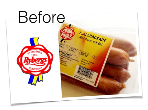
Rybergs Chark gets an updated identity

Monday, February 16, 2015
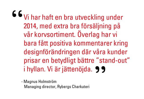
When the new managing director of Rybergs Chark called me up last year and asked if Bakerscape could work with them in modernizing their logo and identity, I was very excited. The company was founded in 1895 and has quite a name for itself on Sweden’s west coast, where it is known for its very delicious sausages with a very high meat content in quite an expansive assortment. The director had a clear vision of retaining the tradition, authenticity and recognizability of its logotype, but getting it to fit in with the times. The packaging would retain its on-site final printing which meant planning for a simple design solution which could easily slip into the current production procedure.
Bakerscape reworked all of the aspects of the old logo into one that can stand proud today. The y and g were carefully twisted together in harmony, the swedish banner was retained in different proportions, and the logo was given some power that it deserves. Quite a difference, and at the same time very much the same!
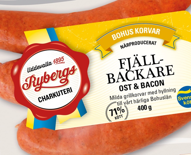
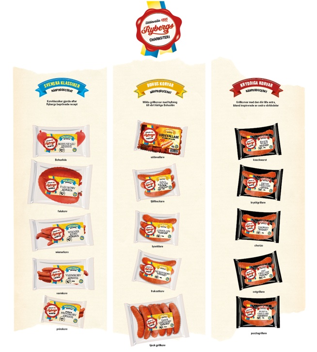
Afterwards, the entire assortment was categorized, new names were considered, colours and products category names were assigned, and new labels were created that could be preprinted up front and finalized with product names, flavour indications and other detailed texts right on the inhouse production facilities.
Now if I can just convince them to start selling these delicious products in other parts of the country besides the west!